PlanetSide 2 - Guns, Data, and the New Player Experience
Jackson Davis Herd • 11 minute read
Check out the full Figma prototype here.
Context
I became enamored with PlanetSide 2 at the start of 2020. I quickly noticed two things: 1) many opportunities to iterate on the games UX, and 2) every major update would cause an increase in active players, but that increase would churn within 1 – 3 months. So I created a hypothetical research plan and survey to study players and understand the playerbase and their friction points.
I decided to focus on newer players, as they’re vital to PlanetSide 2’s massive battles. Specifically, I focused on a common new player pitfall: focusing on buying a “better” gun. All veteran advice says guns aren’t strictly better than another, and the starting guns are fine. The disparity between new players wanting a new gun, and veterans advising against it, led me to iterate on the weapon menu.
Through comparing PlanetSide 2’s weapon menu to other strategy games, and studying data visualization options, I put together a first iteration of a reworked weapon menu system.
Tools
- Notion
- Figma
- Tally
- Scrivener
- Game UI Database
- DataVizProject
- PlanetSide 2 Wiki
Outcomes
You can find the final Figma prototype here. This prototype includes an adapted version of the original weapon menu as well as the iterated menu.
This project gave me a much more holistic perspective on the impact of iterating in a veteran title. The weapon menu (or a variation of it) appears in over 50% of PlanetSide 2’s interfaces, and PlanetSide 2 has existed for over a decade. My iterations could drastically impact the game, but also needed to consider peculiar updates from years ago.
Biggest Achievement: This is one of my largest Figma projects, and I made sure it’s clean and well organized. There are lessons and things I’ll do differently on my next project. But the Figma designs are labeled, and the reference work is categorized. If I needed to hand this off to a coworker I could do so with confidence.
Biggest Lesson: Scope creep can’t be passively avoided. At points this project became a full screen iteration instead of just the weapon menu. This would have taken longer and not been relevant to the research goal. I started a habit of ensuring my tasks stayed relevant, and became comfortable “killing my darlings”.

While this was a solo research project, I created documentation and organizational structure as though it would be shared across internal development teams.
Research plan
I designed a mock research plan that could be run by the PlanetSide 2 developers, Rogue Planet Games, to discover these opportunities. This included a full research plan doc, survey, interview discussion guide, and consent forms.
With no opportunity to run this research on players, I turned to PlanetSide 2’s chat, forum, and Steam reviews. Many new(er) players ask: “My gun is bad, what guns are better?”. The response from veteran players highlights a major disconnect: “One gun isn’t strictly better than another / the starting guns are fine”.
Where is this disparity coming from and is there a design solution? Answering this requires some brief background on PlanetSide 2’s design and genre.
PlanetSide 2 Steam reviews

It’s important to note the sentiment behind this review is important, even if it’s not accurate (i.e. new players have the same health and shields as veterans with rare exception).

A Steam review of PlanetSide 2 that highlights an important shortcoming of the Infiltrator class starting weapons conflicting with how a new player would expect to play.
PlanetSide 2 guides
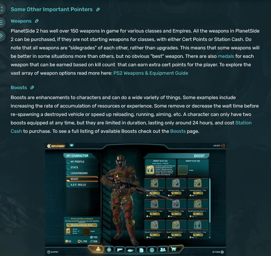
A screenshot of the Getting Started page of the PlanetSide 2 wiki that explicitly states there is no “best” gun. Guns have slight differences that make them excel in specific combat situations.
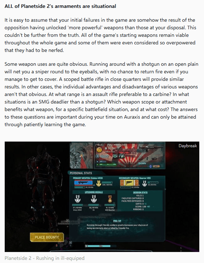
An excerpt of Omar Okic’s article “Five tips to ease your entry into Planetside 2 as an infantryman” via altchar.com.

A portion of the New Player Guide 2023 by Steam user Banan. Not only does the guide advise against buying new weapons, but even suggests upgrading everything BUT your weapon first.
Background
PlanetSide 2 has around 300 total guns, knives, rocket launchers, and more. This is a colossal number of weapons. If we limit this to only guns it’s still dozens of data points, and a lot of information for a new PlanetSide 2 player.
PlanetSide 2’s guns aren’t objectively better than one another. As an example, below is the TRAC-5, a starter gun for the Terran Republic faction, and the T5 AMC, another Terran Republic gun that can be purchased. Could you summarize what makes these weapons significantly different?
TRAC-5 – High fire rate, less accuracy and damage mean a closer effective range.
T5 AMC – Slightly lower fire rate than the TRAC-5, but higher long-range damage and muzzle velocity means a longer effective range.
This is challenging even when the guns have all their stats listed. And some stats aren’t fully displayed (these appear on hover).

The stats for the TRAC-5 gun are located to the right of the image of the gun. Some of the stats are truncated, but try to determine what makes it different from the T5AMC below.

The stats for the T5 AMC gun are located to the right of the image of the gun. Some of the stats are truncated, but try to determine what makes it different from the TRAC-5 above.
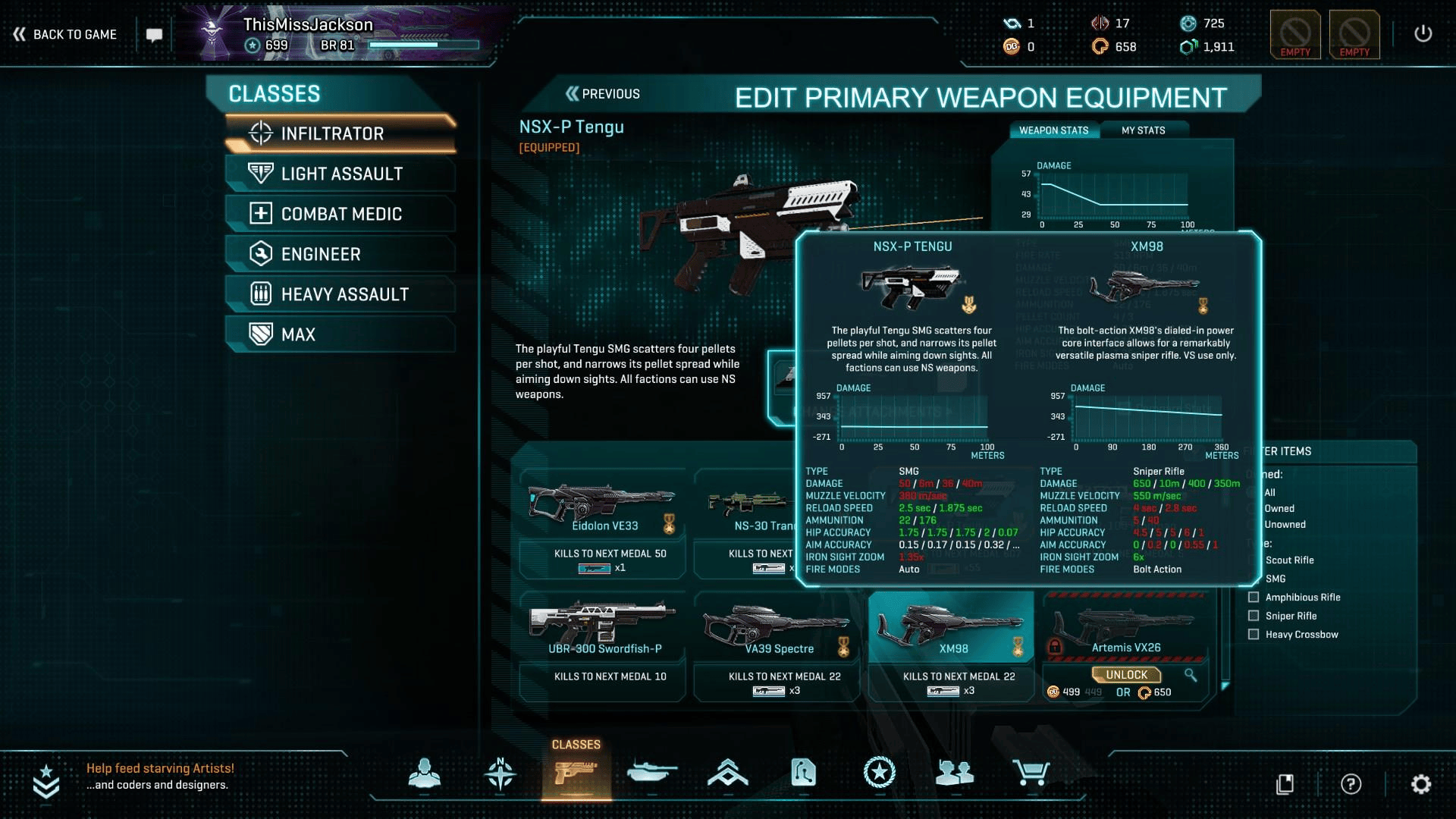
Unfortunately some stats are still truncated when comparing guns. And the winning/losing stats are highlighted in red and green, the most common version of colorblindness.

Via the National Eye Institute almost 10% of the world is coloblind. Players ignore games that ignore players.
Also, the weapon comparison window uses red/green which is inaccessible for colorblind players.
All of these pose a big knowledge hurdle for new players. Typical FPS games have streamlined this experience – and there’s the issue. PlanetSide 2 may market itself as an FPS, but it has a clear lineage in the strategy game genre.
Strategy games
PlanetSide 2 describes itself as a “massively multiplayer online first person shooter”, or MMOFPS. But this ignores the game’s roots in the strategy genre. At a high level, PlanetSide 2 is about huge armies, attacking and defending, gathering resources, even a platoon > squad > fireteam system. At a more granular level, PlanetSide wants players to have multiple equipment loadouts to adapt your strategy to where you’re fighting. Both levels are similar to strategy games, real-time and turn-based.
Game UI Database
How do other strategy and shooter (not just FPS) games handle explaining this amount of data? Using GameUIDatabase as a resource, I set up a spectrum of screenshots from a variety of games in FigJam.


These annotated screenshots were referenced from the Game UI Database. A truly massive repository of >53,000 screenshots, and a goldmine for anyone working in or around UI.
Examining these screenshots we can see:
- Straightforward shooters either don’t display weapon stats, or display nondescript ordinal/interval data.
- Games in the middle of the spectrum display a numbers and data, though this is usually in the format of one metric = one number.
- Strategy games lean into traditional data visualization, taking big advantage of iconography, tables.
Iterations
With the data of a strategy game but little data visualization assistance, PlanetSide 2 is in an awkward position. I assume, for hypothetical research purposes, data presentation is the primary suspect for new players misunderstanding PlanetSide 2’s guns. My 3 steps for iterating and alleviating this misunderstanding are:
- Clean, organize, and teach the stats listed
- Design a data visualization solution that can help new players quickly understand a weapons archetype
- Make the weapon comparison process colorblind accessible
Cleaning and organizing
This started with adding more whitespace and rows. Adding space and structure helps readability, and display stats that were previously hidden. I also limited some metrics to only 2 decimal places. This was a big issue for reload speeds, which were listed to the thousandth.
With all data displayed, some stats needed to be put into a new format. I created individual tables for the complex Hip Accuracy and Aim Accuracy stats to align with typical strategy game data visualization.
I also rewrote many of the tooltips that when hovering above the stat. This started with sketching out possible ideas, including iconography, and removing tooltips entirely. Eventually I settled on keeping the tooltips, but improving their educational content.


Click and drag the arrows in the middle of the image to swap between the original weapon menu (re-created in Figma) and my iterations.
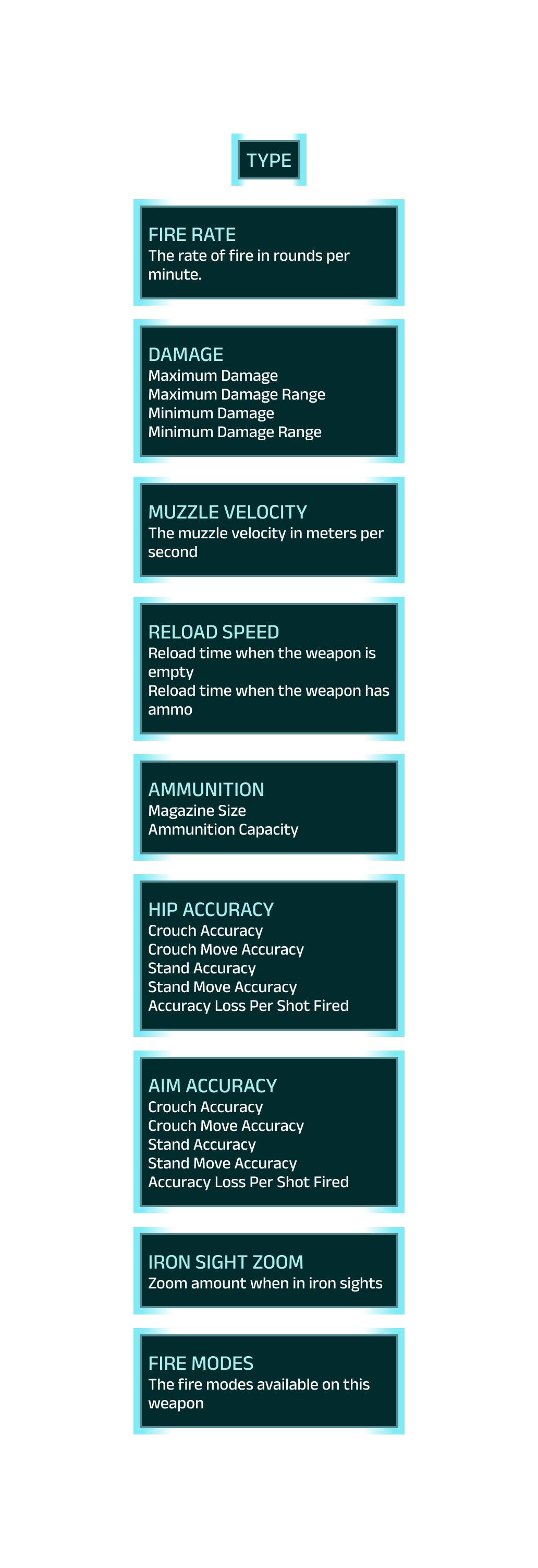
The original tooltips for each weapon stat. The TYPE tooltip did not contain any context.

My iterated weapon stat tooltips. I tried to use similar language and terminology wherever possible. I also added weapon descriptions for each weapon type for the TYPE tooltip.
TYPE: Rewritten to list a brief, 2 sentence summary of the relevant weapon type.
FIRE RATE: Rewritten to not use the term in its definition, added “rounds per minute (RPM)” as the acronym appears in the weapon menu.
DAMAGE: Separated into 2 metrics: MAXIMUM DAMAGE, and MINIMUM DAMAGE.
MUZZLE VELOCITY: Rewritten to not use the term in its definition, and using the “rounds” terminology used in the FIRE RATE tooltip.
RELOAD SPEED: Rewritten, “when the weapon is empty / has ammo” can be misinterpreted as the weapon’s total ammo instead of the weapon’s magazine.
AMMUNITION: Minor rewrite.
HIP ACCURACY / AIM ACCURACY: Understanding this metric took additional research. A huge thank you to both the PlanetSide 2 wiki, and former PlanetSide 2 player Iridar’s weapon mechanics explanation. Making individual tables for these accuracy metrics solved much of the problem as all of these numbers and states are relevant and need to be displayed.
IRON SIGHT ZOOM: Renamed to “ZOOM” and rewritten.
FIRE MODES: Minor rewrite.
I then removed the damage/distance graph as it was shockingly identical across the majority of the guns in PlanetSide 2. Meaning this graph could not be quickly understood, and needed to be specifically examined for little benefit over the DAMAGE metric that was already displayed.

I reviewed multiple data visualization options from the Data Viz Project, including population pyramids, radial bar charts, and even hive plots.
New data visualization
I researched and sketched multiple options to replace the damage/distance graph. I reviewed DataVizProject and sketched 8 different options to test what would best fit. Out of the options I tested, a radial area chart was the most efficient way to display and compare stats.
I couldn’t simply list all weapon stats in a single radial area chart, especially when these metrics can be as large as 800, or as specific as a hundredth. I chose to summarize and interpret a gun’s stats into 4 major categories: Power, accuracy, range, and mobility. These transformed stats can help newer players quickly ascertain a gun’s strengths and weaknesses.
Gun comparisons
Labeling with only color is inaccessible, but adding symbols (a second level of encoding) can help with accessibility. I removed the red/green highlighting from the original comparison process and added green up arrows and red down arrows for metrics where it made sense. I created a third symbol, an orange square, for incomparable metrics, such as fire modes, or ties between metrics.


Using a second style of encoding, instead of only color, is one option to help make visual design choices more colorblind friendly.
Next steps
You can find the final Figma prototype here. It’s fully interactive, and can switch between the original and iterated versions of the menu.
If I was to continue this project then I would be testing these changes against the original with users. A survey paired with this interactable prototype would make a powerful A/B test to measure if the disparity in understanding PlanetSide 2’s guns is lessened.
This is a long list of changes in a systematically dense game. I didn’t even begin to touch on the gun metrics that aren’t listed in-game (thanks again to the PlanetSide 2 wiki for these). It’s a lot of data! And it would take multiple tests and iterations before arriving at something that best solves the problem. While these changes aren’t the perfect solution, they are a step on the way to get there.